Cape de Coeur: Where technical performance meets high fashion
CLIENT: CAPE DE COEUR
ROLE: LOGO, BRAND IDENTITY & ART DIRECTION
Cape de Coeur answers a specific dilemma for the luxury consumer: how to protect investment pieces without compromising style. The brand creates high-end capes using advanced, waterproof technical fabrics, designed to layer seamlessly over couture clothing. The challenge was to communicate "heavy-duty weather protection" without speaking the visual language of outdoor hiking gear. The brand needed to feel as timeless and established as the heritage fashion houses it sits alongside.
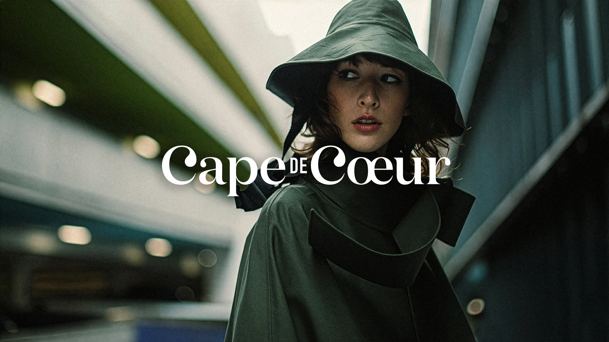
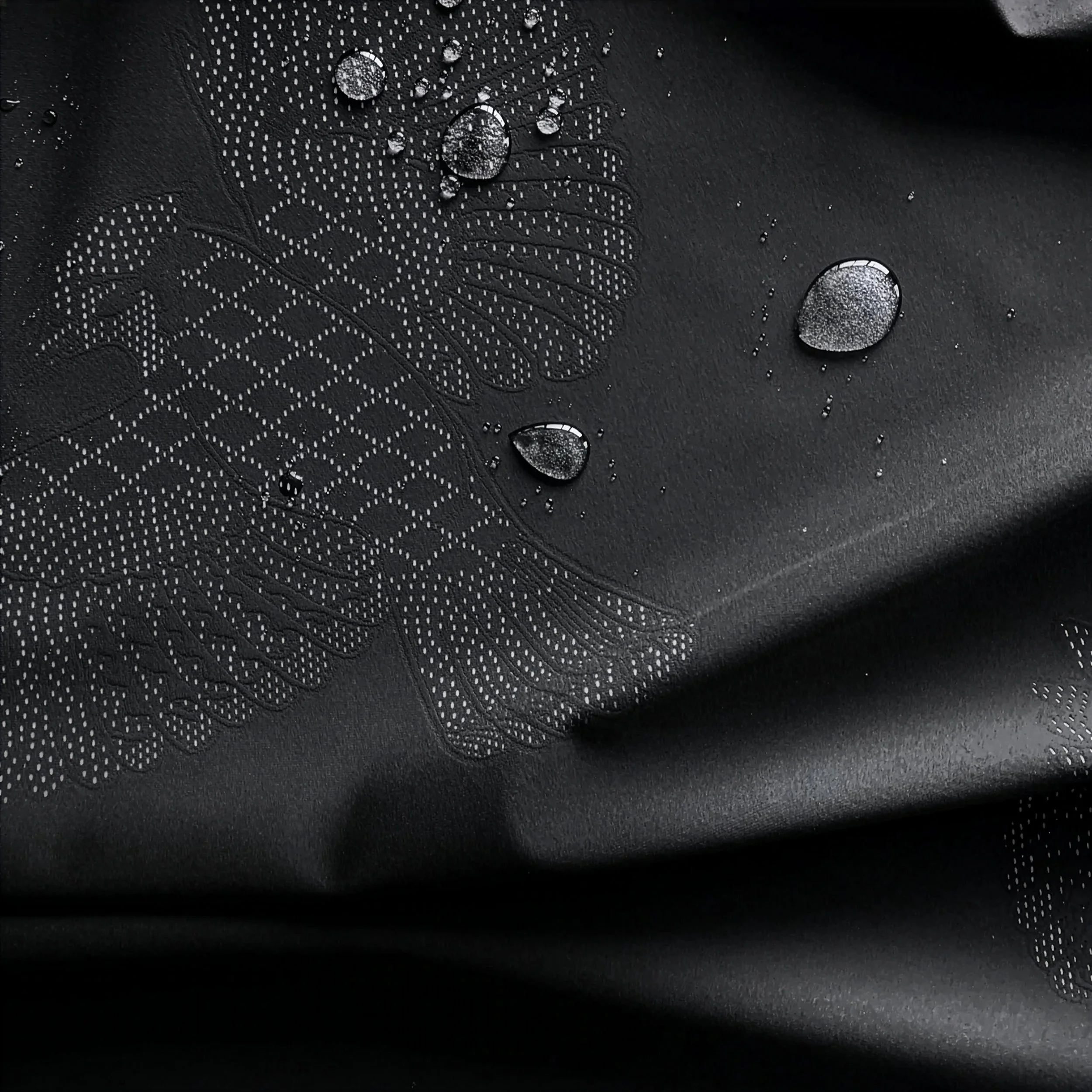
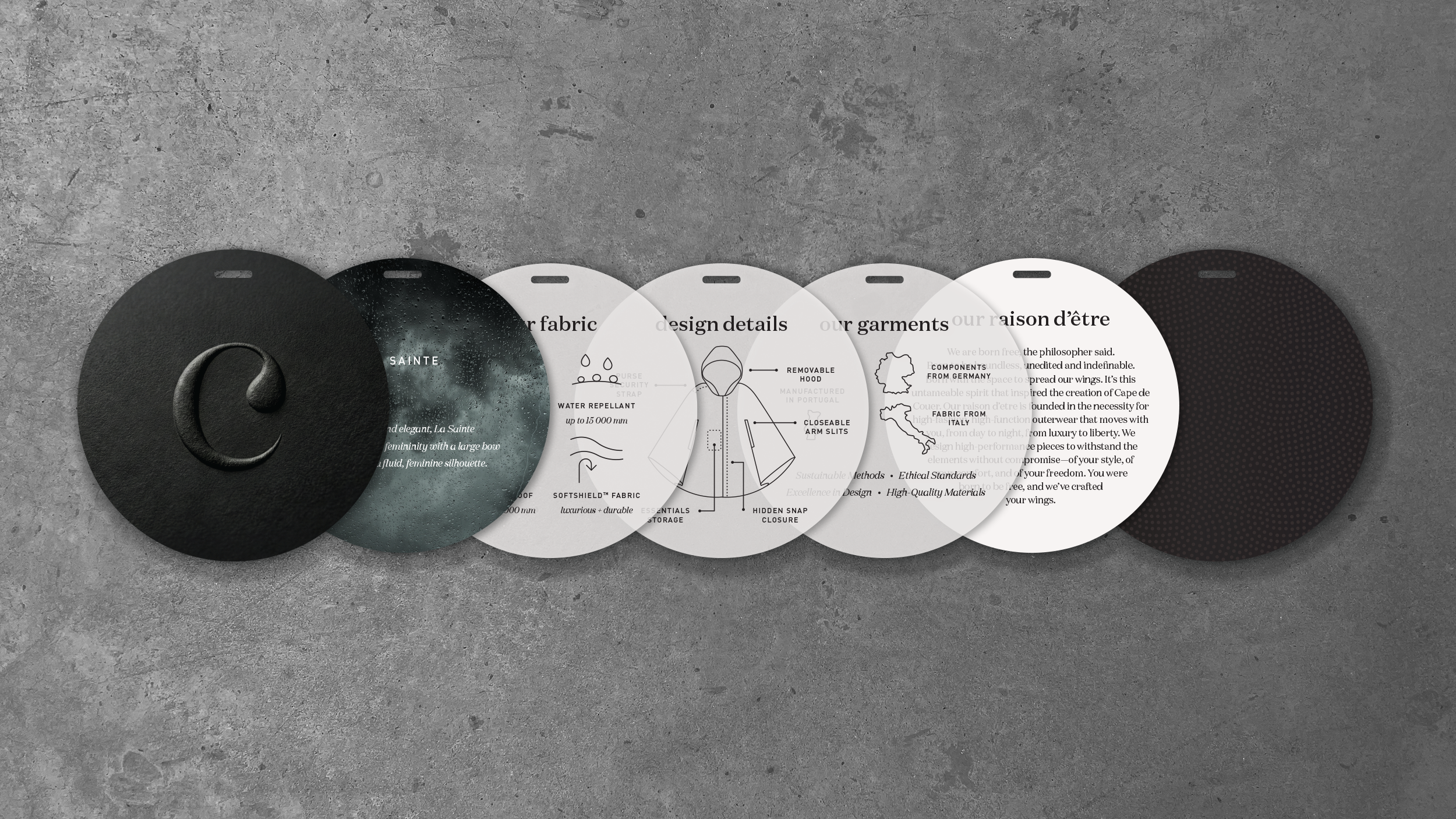
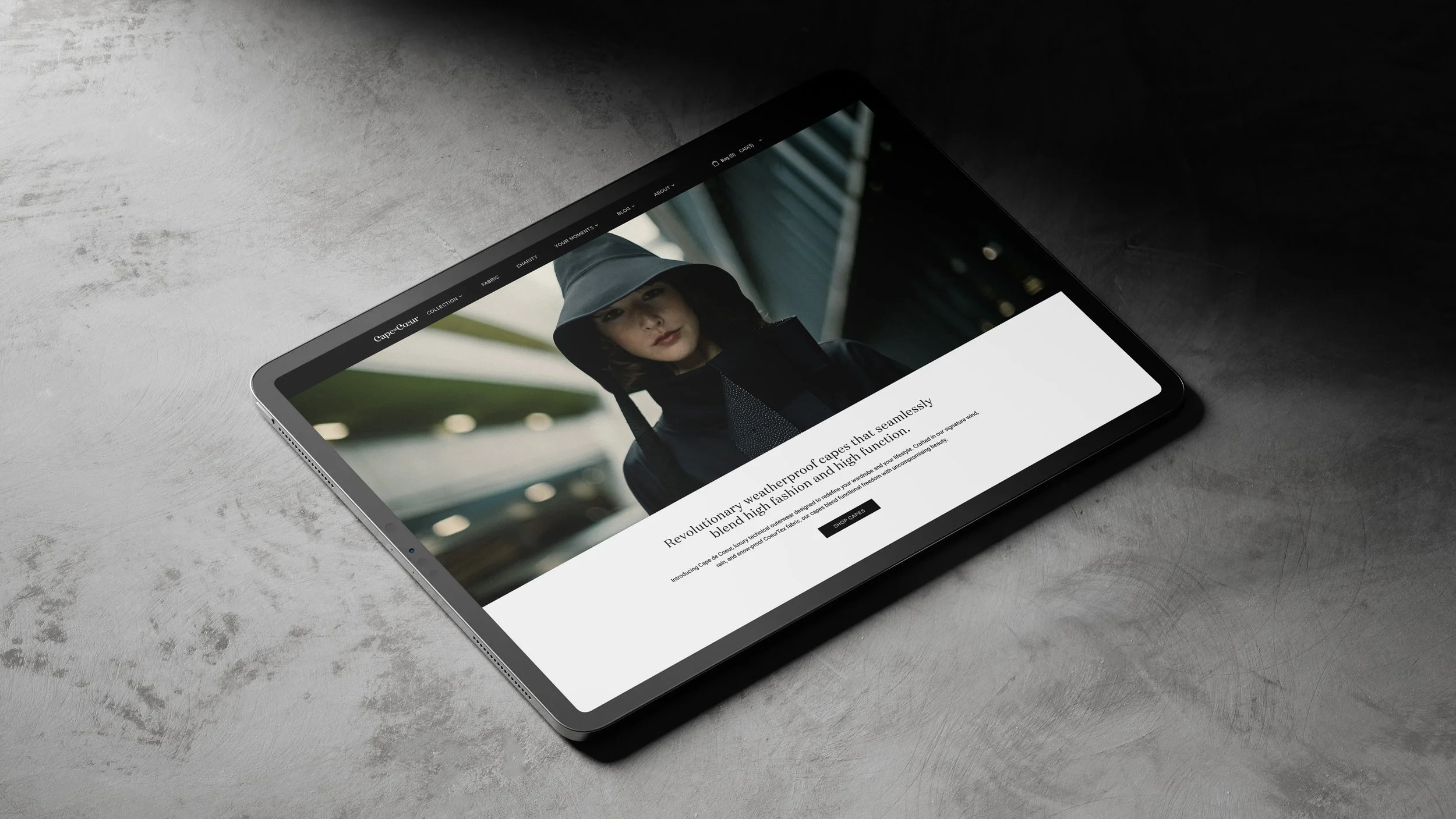
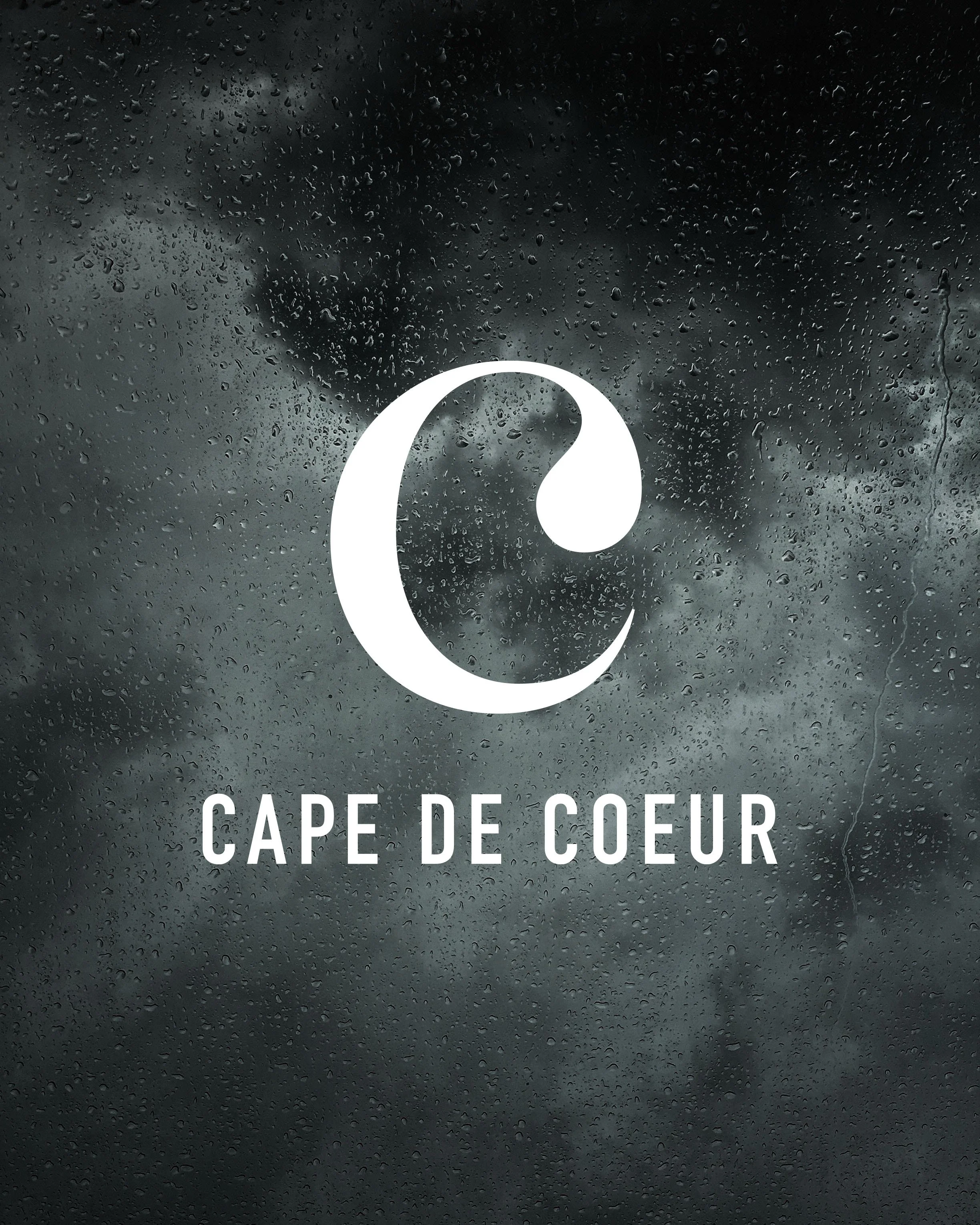
To achieve this high-fashion positioning, we established a dark, moody art direction that evokes the feeling of the elements, grounding the cape in the environment it was designed to conquer. A defining element of this visual world is the proprietary dot pattern, which we pulled directly from the garment's fabric design. We elevated this texture into a central graphic device across the identity, using it to mimic the rhythm of falling rain and create a seamless visual connection between the physical product and the brand communications.
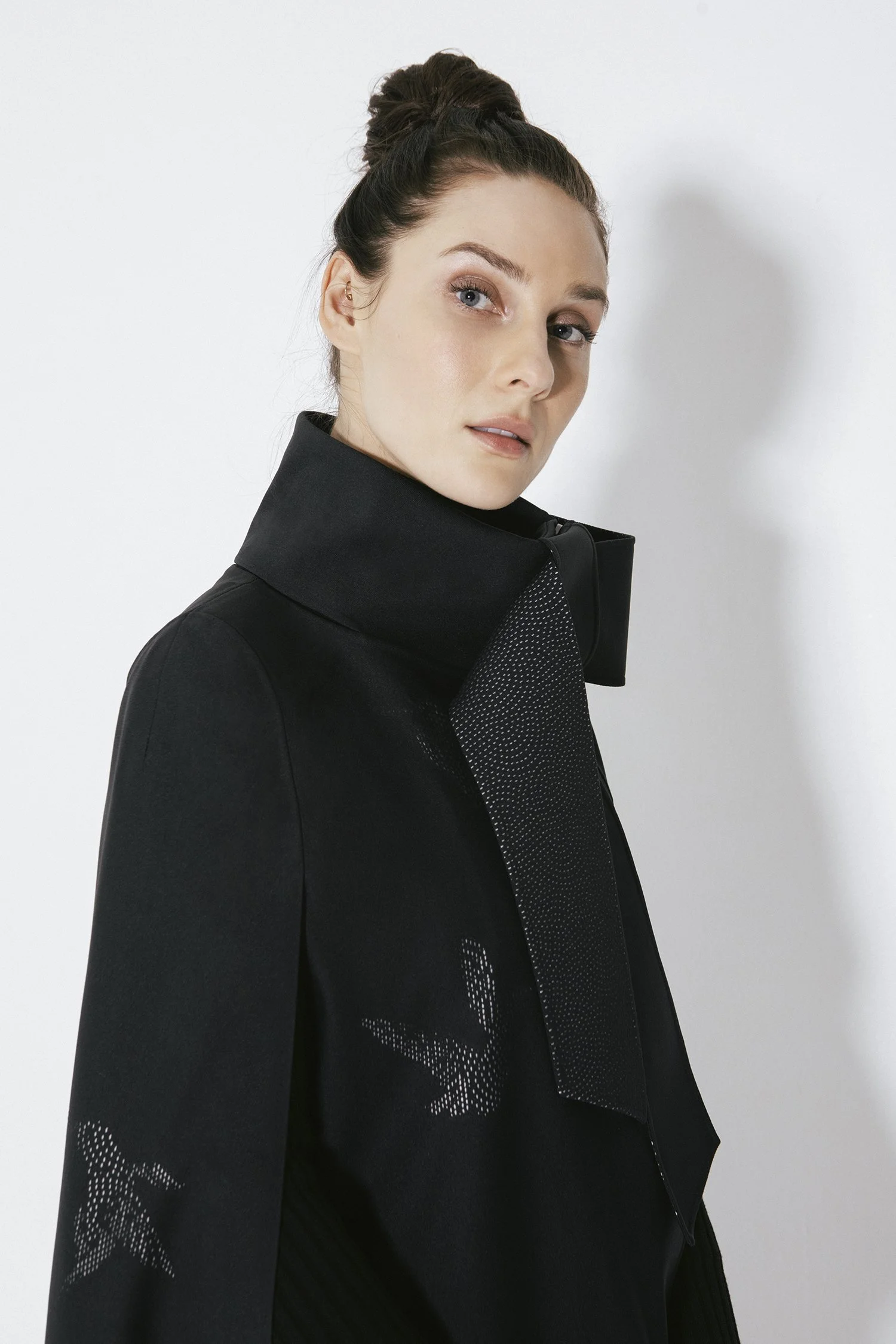
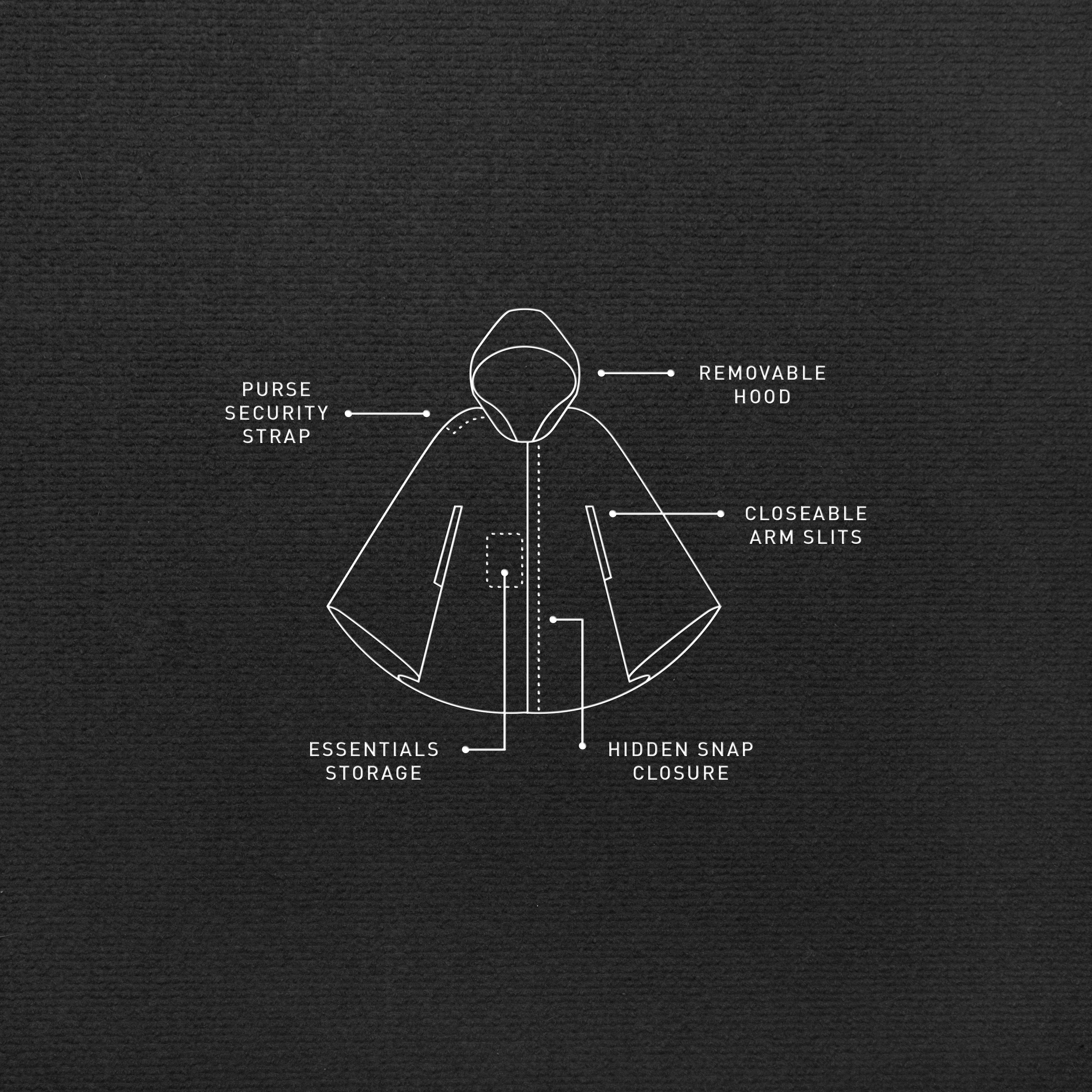
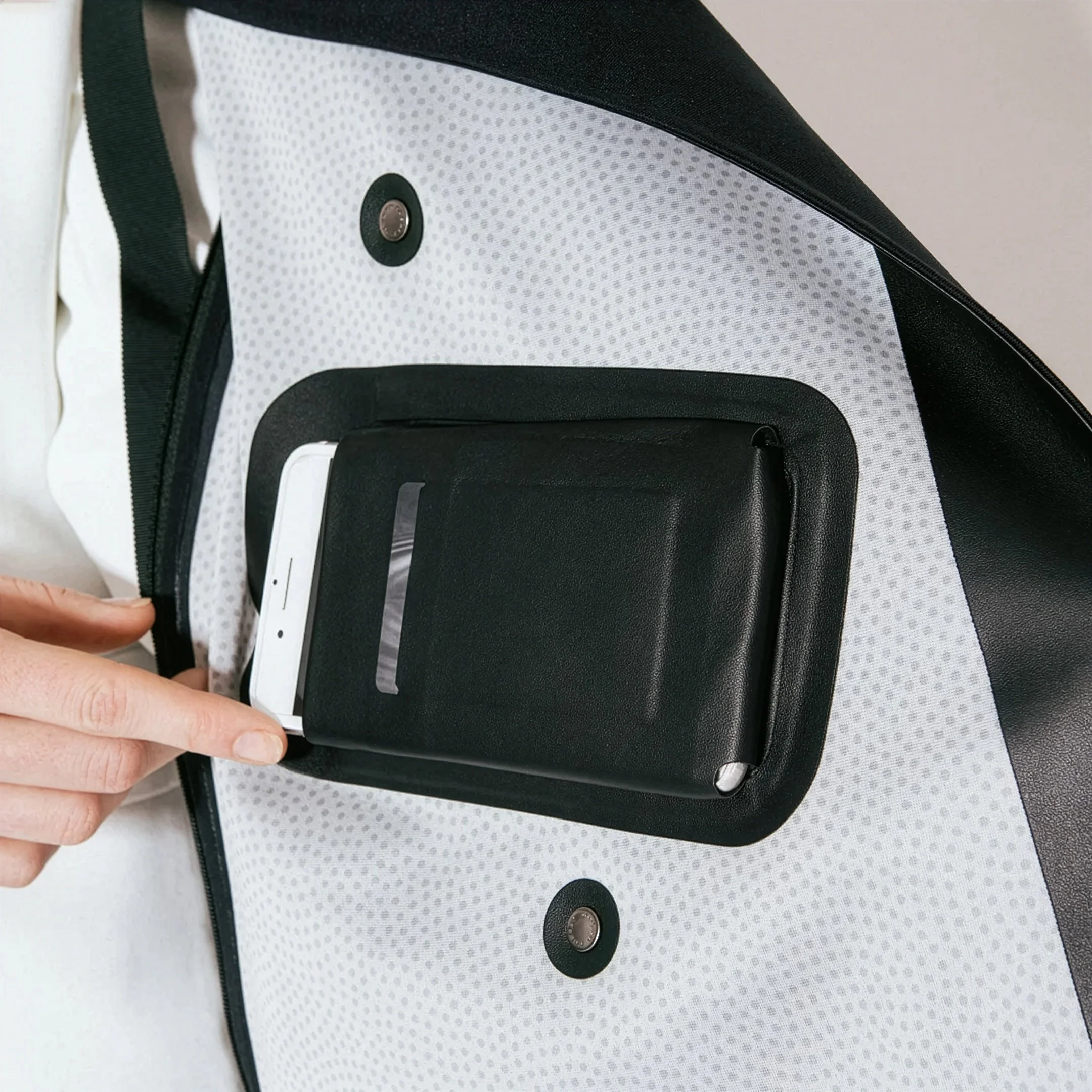
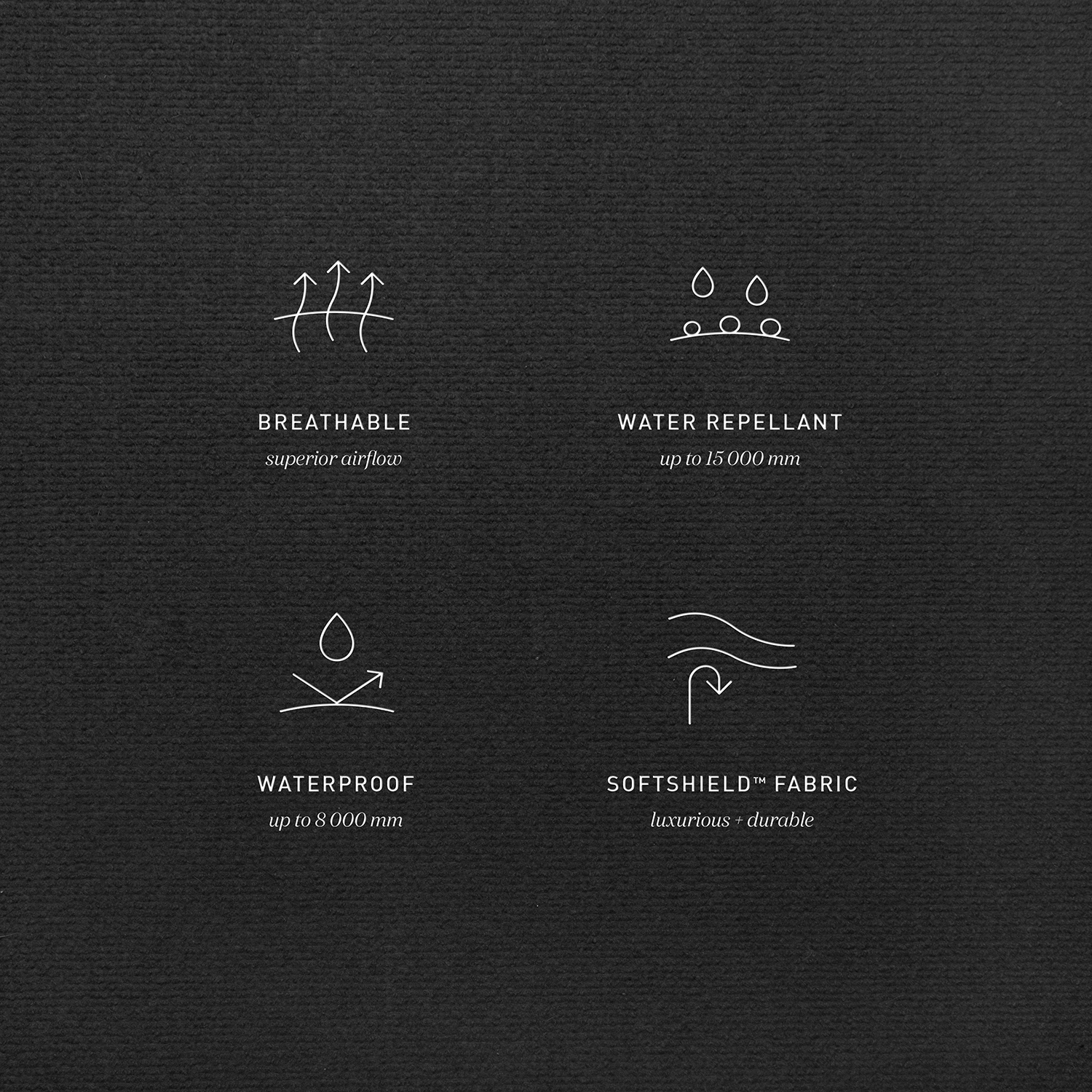
Balancing the atmospheric mood, the system relies on a sharp contrast between emotion and information. We paired the cinematic brand imagery with clean, high-contrast technical photography to showcase the garment’s engineering without losing its elegance. To further communicate the utility of the piece, we designed a suite of custom technical diagrams and functional icons that break down specific features. This juxtaposition of stormy, emotive visuals with precise, clinical details perfectly communicates the brand's dual promise of beauty and resilience.