Micron Mechanical: Modernizing the trades through precision branding
CLIENT: MICRON MECHANICAL
ROLE: LOGO & BRAND IDENTITY
The company needed a brand identity that would elevate them from a standard service provider to a leader in technical precision. The goal was to build a visual language that reflected their obsession with detail and the microscopic scale of air filtration. We moved away from the generic tropes of the industry to create a brand that feels engineered, deliberate, and scientifically driven—positioning them as true experts in climate control.
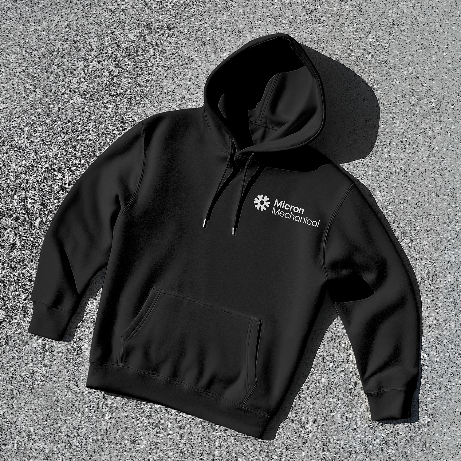
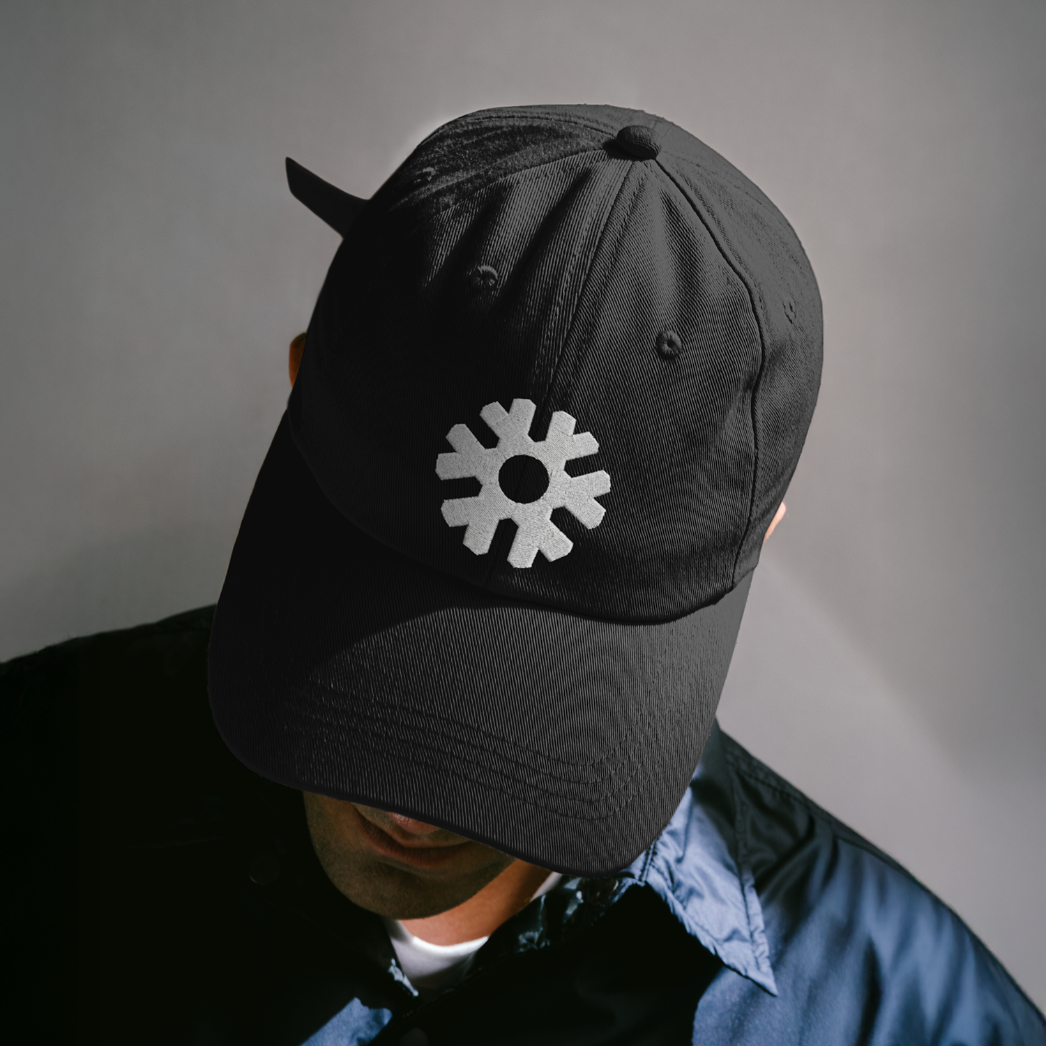
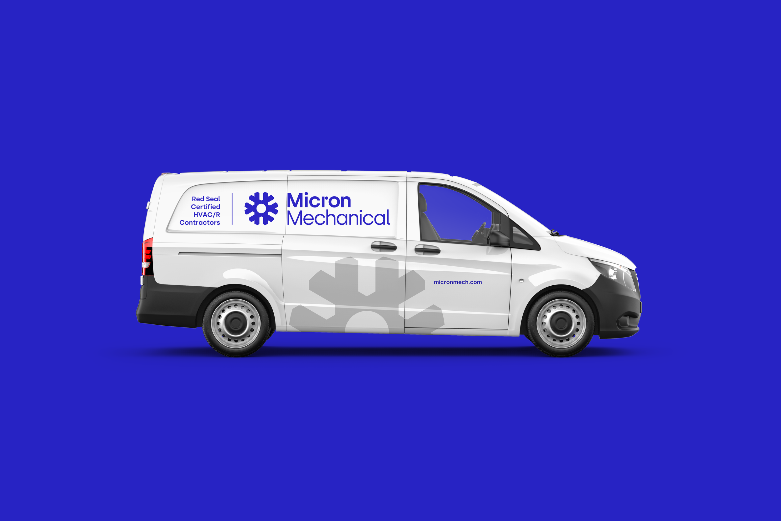
The heart of the identity is a custom symbol that synthesizes two core concepts: a mechanical gear representing the physical craft, and a crystallized snowflake representing the cooling output. To balance this industrial structure, we introduced a fluid color gradient that flows through the brand touchpoints, visualizing the invisible movement of air. This combination of rigid geometry and organic motion creates a system that feels both highly technical and dynamic.
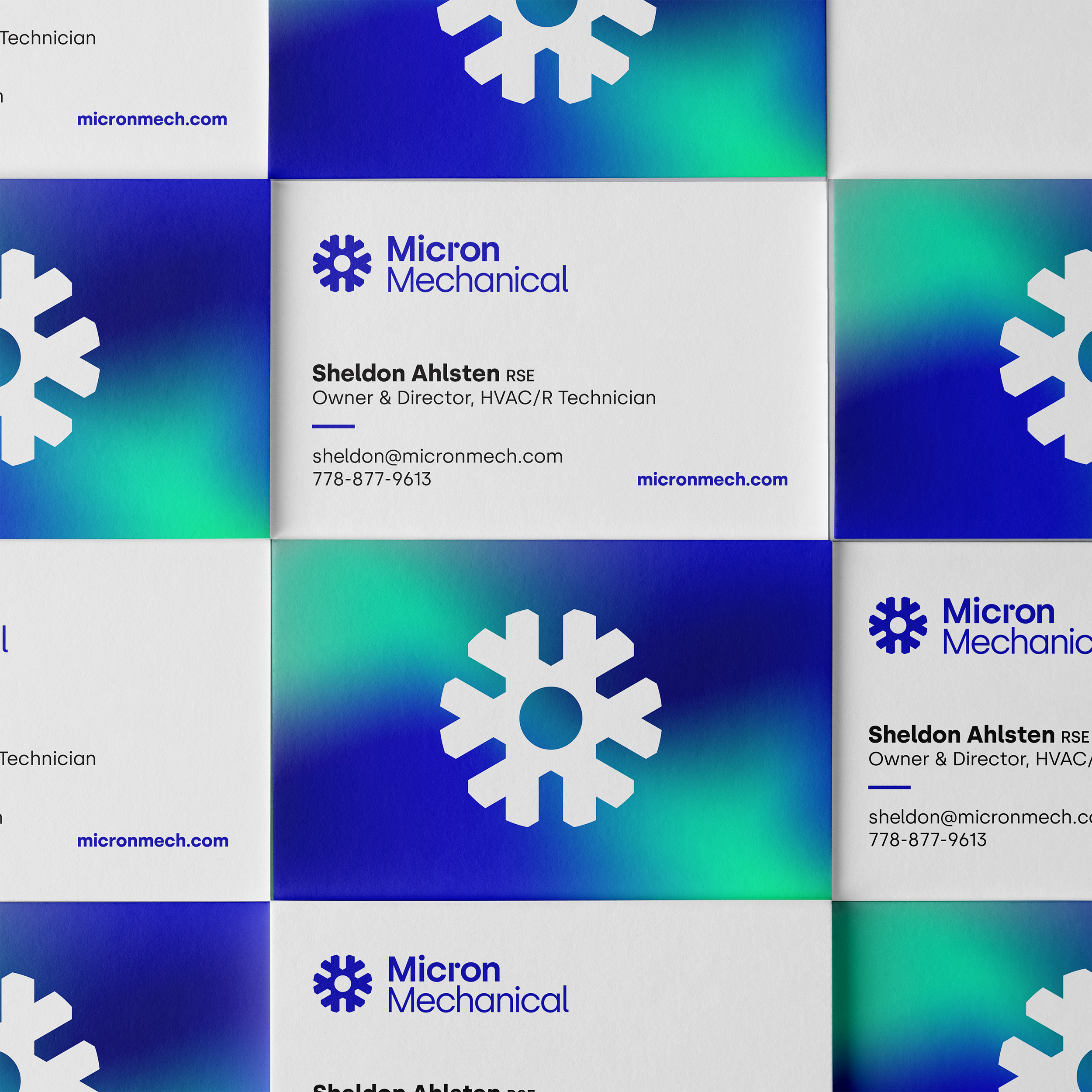

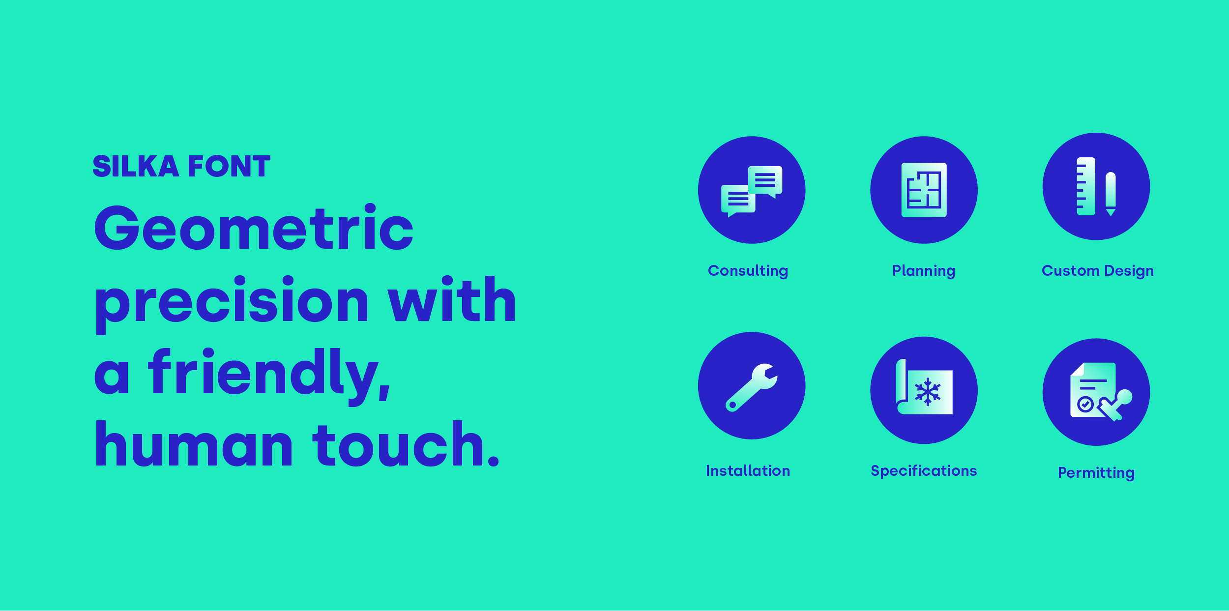
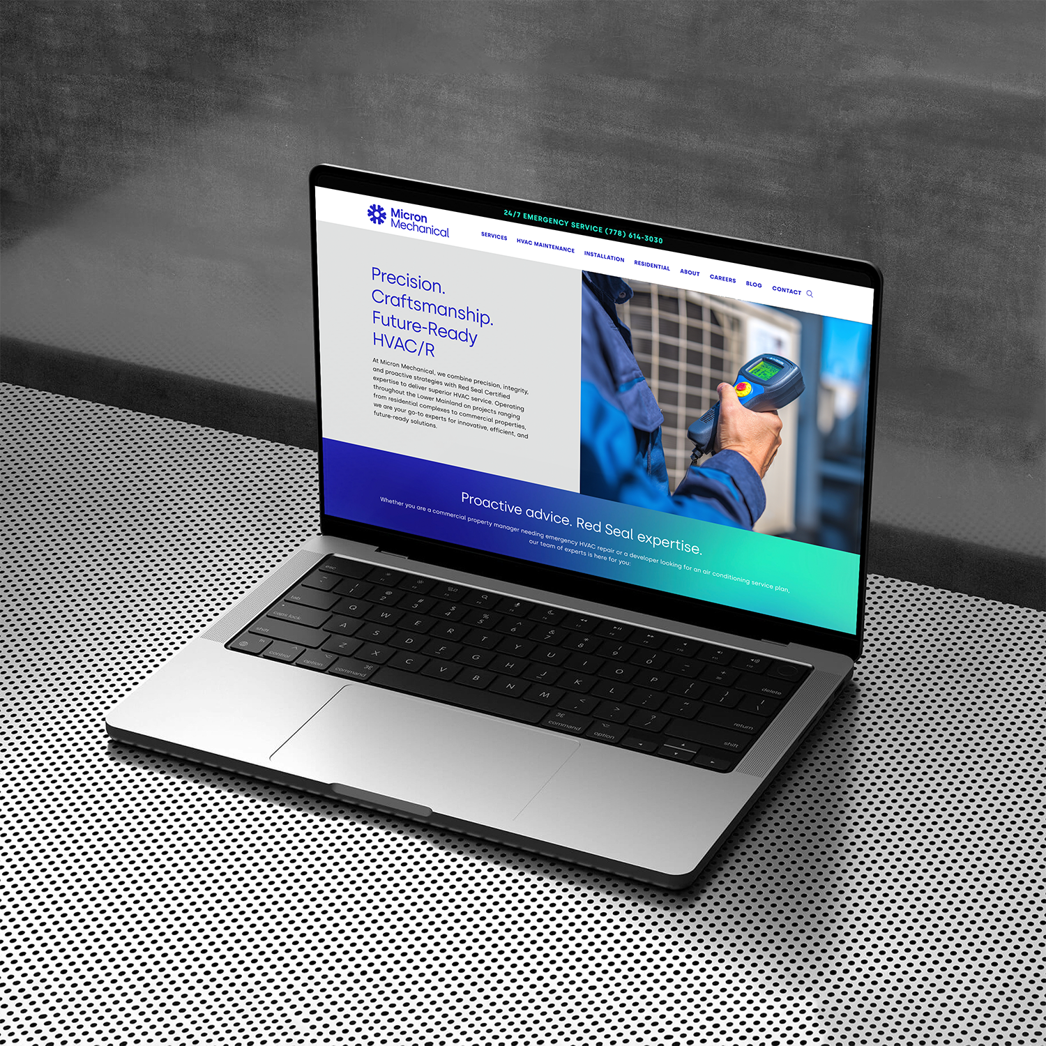
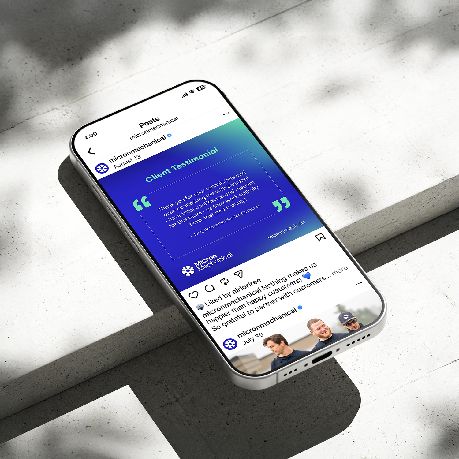
Beyond the logo, we developed a comprehensive design system including a suite of custom icons to communicate their specific services clearly across the new website. A major success of the project was the application to physical touchpoints, including fleet vehicle wraps and employee uniforms. We designed the apparel to pass the "T-Shirt Test"—ensuring the gear and snowflake icon looked cool enough for the staff to wear proudly both on and off the job site, turning the technical team into genuine brand ambassadors.