Fig: Humanizing the digital lending experience.
CLIENT: FIG FINANCIAL
ROLE: LOGO & BRAND IDENTITY
PHOTOGRAPHY: FIG INTERNAL TEAM
Fig challenged the predatory lending market by offering a transparent, digital-first alternative for Canadians.
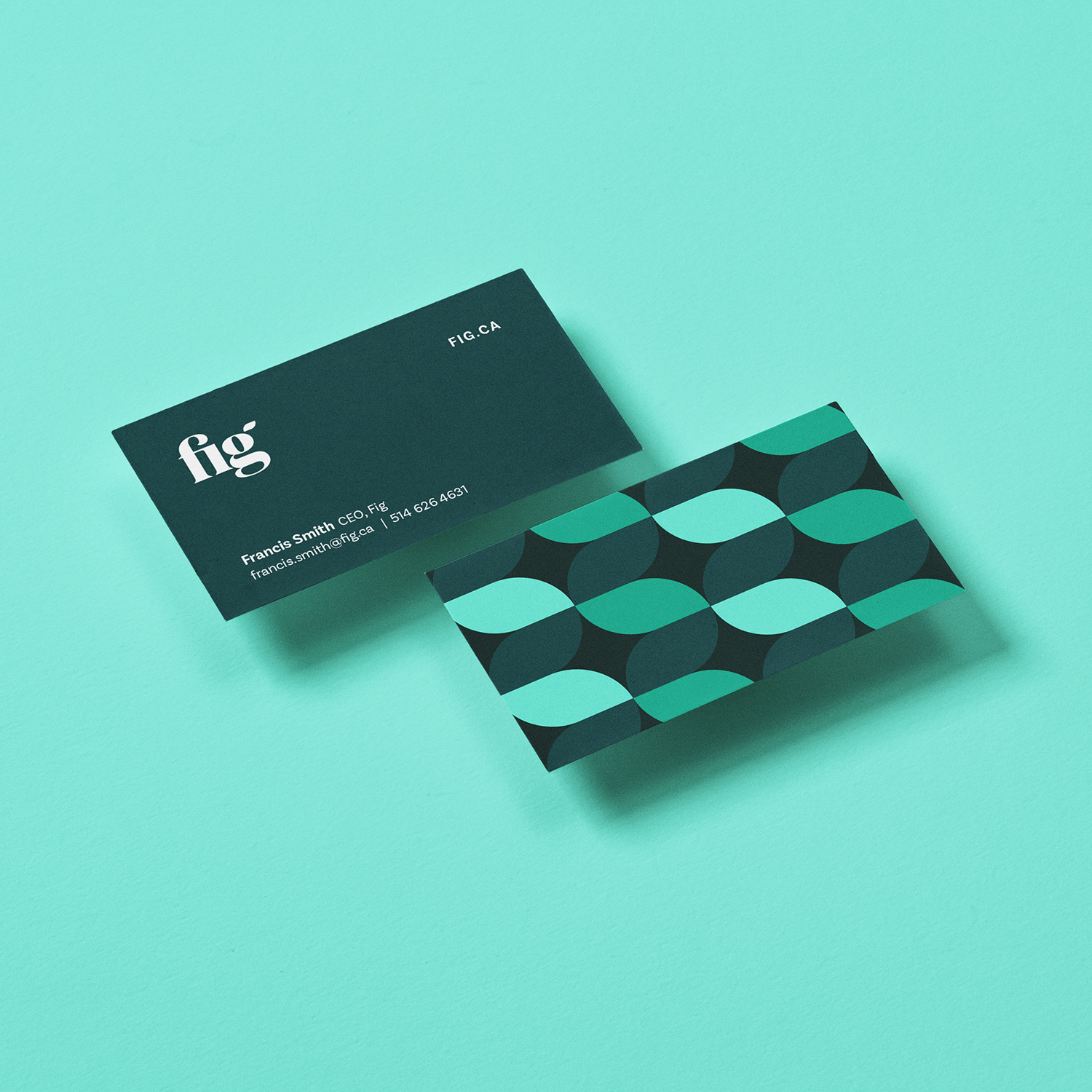
Incubated by Koru and the Ontario Teachers' Pension Plan, Fig needed to enter the market quickly and lean. Working with a focused startup budget, I prioritized speed to market. We delivered the foundational building blocks—a strong logo mark, a core colour system, and accessible Google typography—to get the product live and testing with real users immediately.
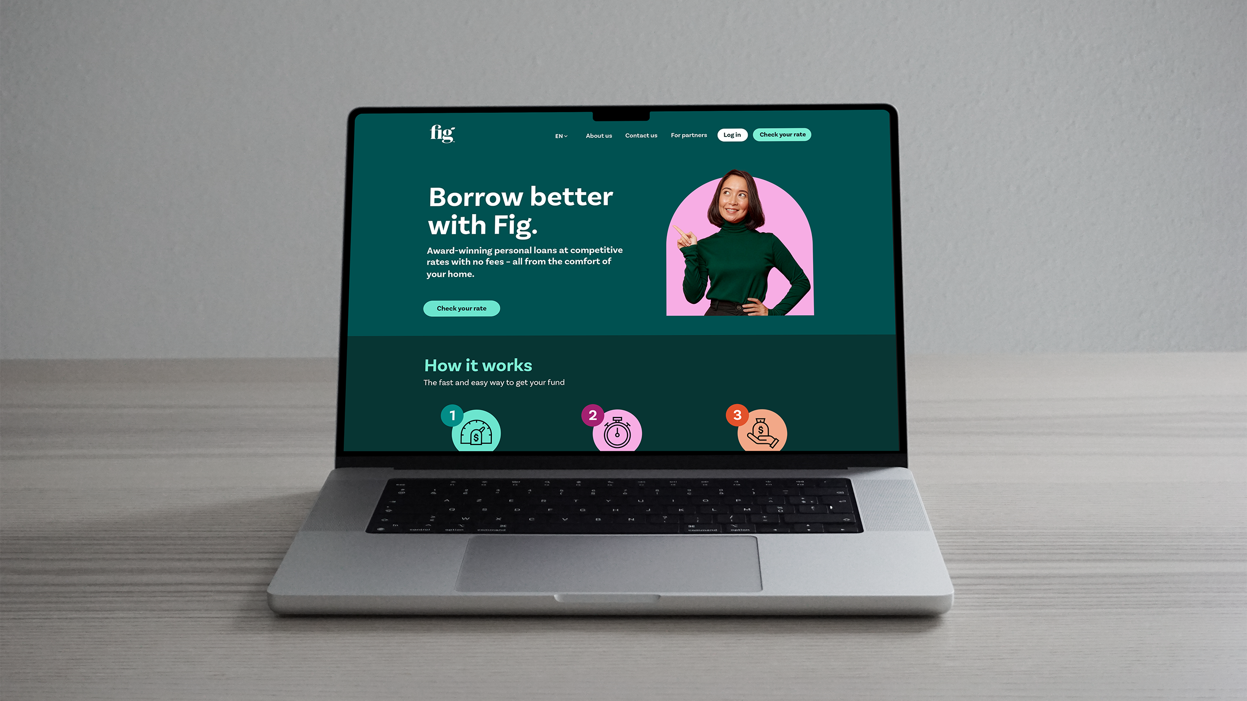
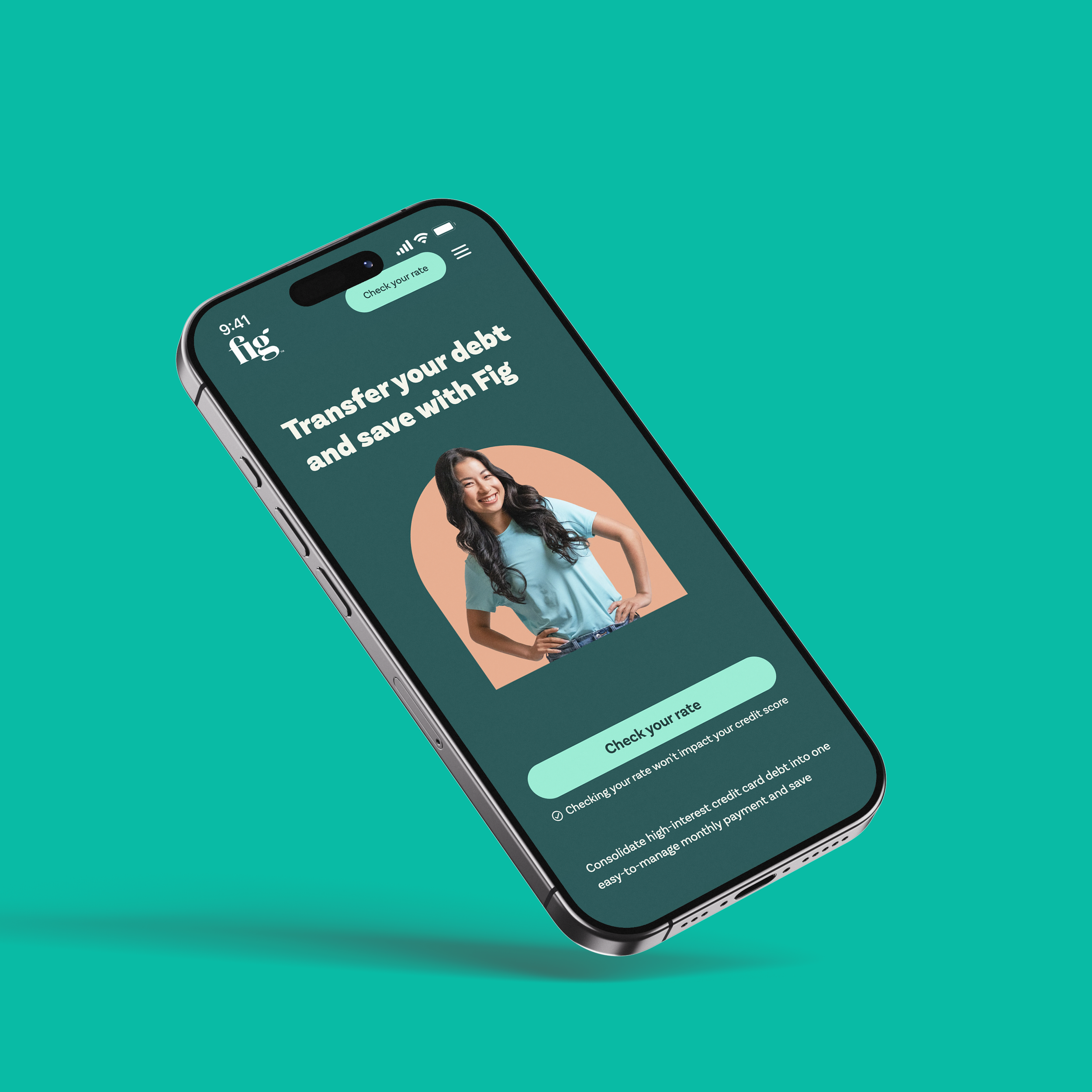
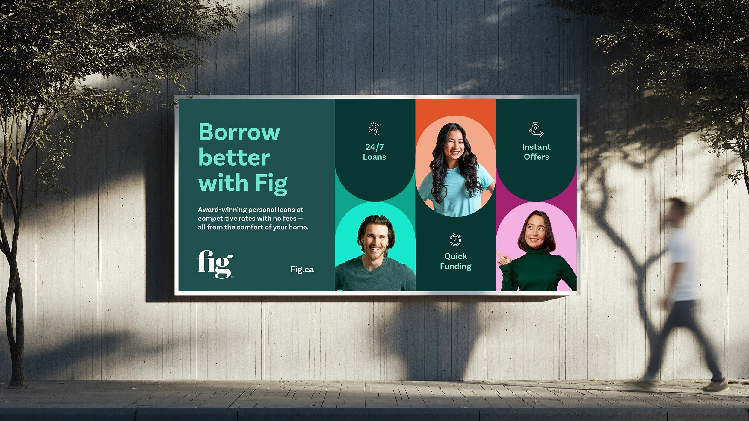
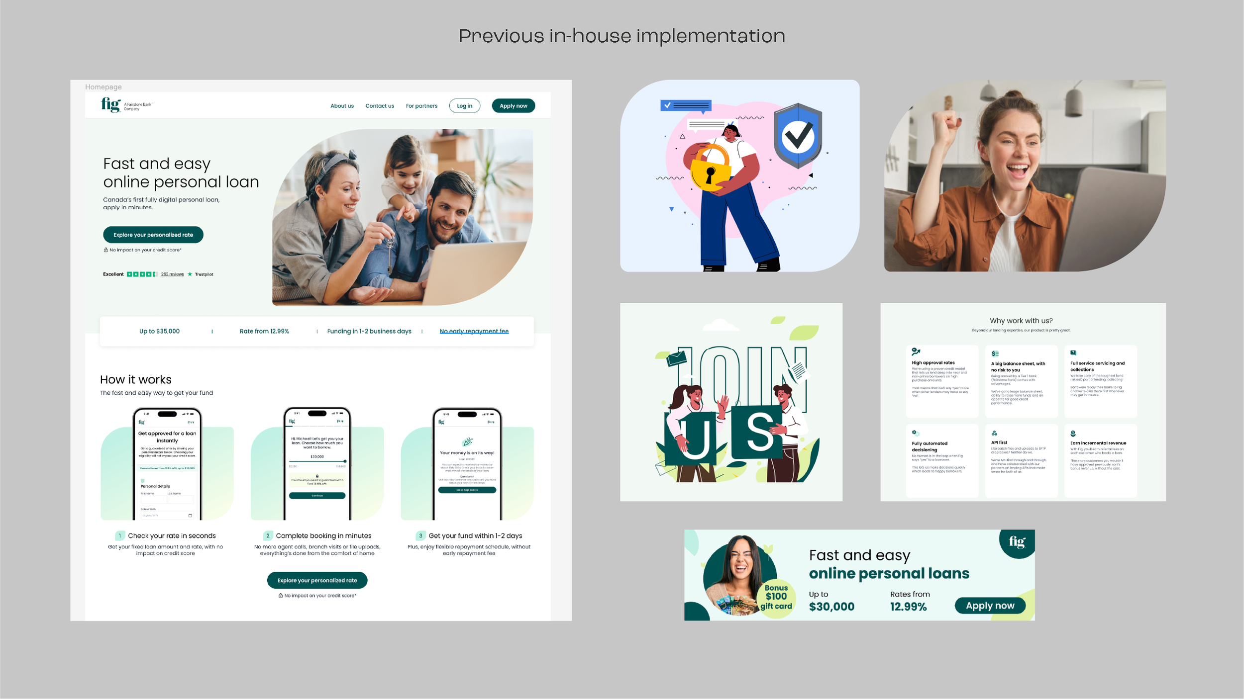
Post-launch, we conducted a brand audit and identified a critical gap: the brand was blending in. Analyzing the Canadian landscape, we realized that institutional giants rely on color dominance—Scotia Red, TD Green, RBC Blue. Fig’s usage of teal was too polite, and the website relied on generic stock photography and illustrations that failed to build trust. We realized that to compete with the giants, Fig needed to "own" Teal.
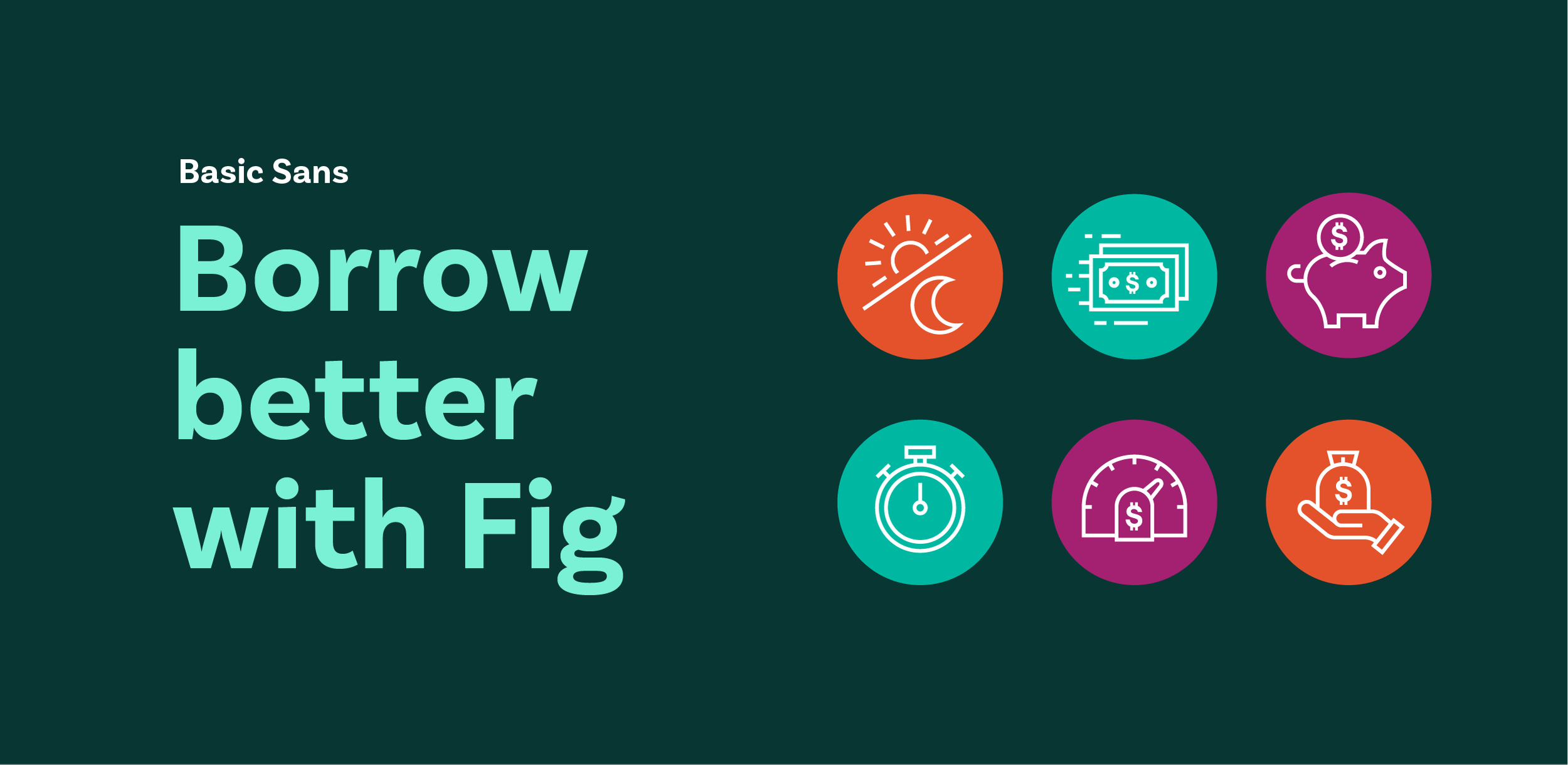
We shifted the strategy to aggressive color dominance.
We flooded the brand with the primary teal to build instant recognition, supported by a punchy, unique secondary palette. We pivoted away from abstract illustrations, directing a custom photoshoot with wardrobe styled to match the new palette. Paired with a bolder icon set, the result was a distinct, ownable system that stood apart from the "sea of sameness" in fintech.