Jetlines: Designing Canada’s ultra low-cost airline
Launching a challenger airline requires navigating a high-stakes, regulatory-heavy industry where brand distinctiveness is the only way to survive. The objective was to create a bold identity designed specifically to stand out against the expensive, incumbent "goliath" airlines. We needed a visual system that was not only authentic and accessible but deliberately distinct in a sea of corporate sameness.
CLIENT: CANADA JETLINES
AGENCY: COSETTE COMMUNICATIONS
ROLE: CREATIVE DIRECTION, LOGO & BRAND IDENTITY
DESIGN COLLABORATOR: CAR BORNE
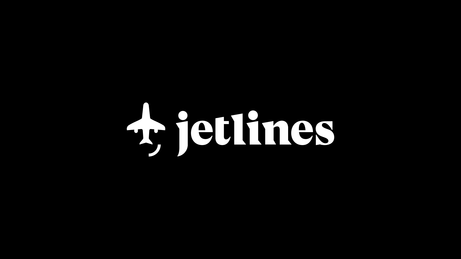
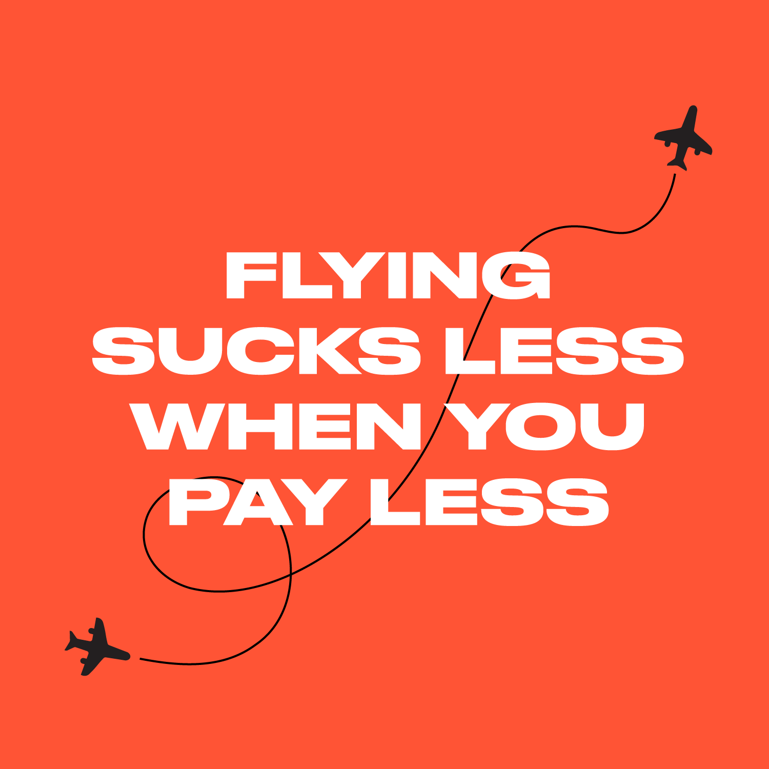
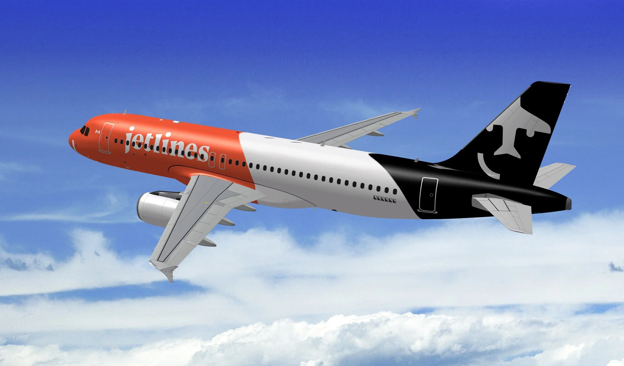
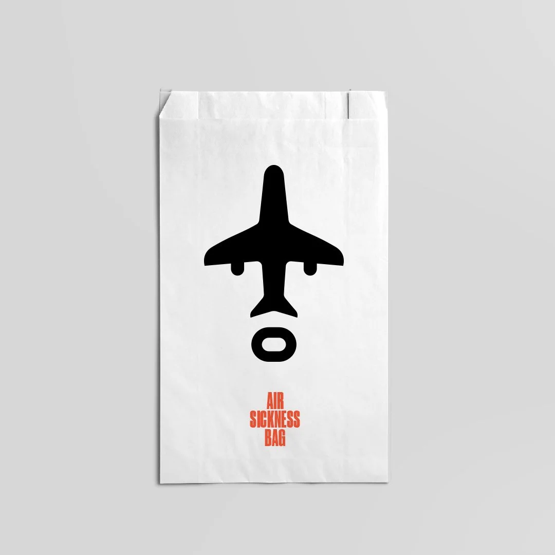
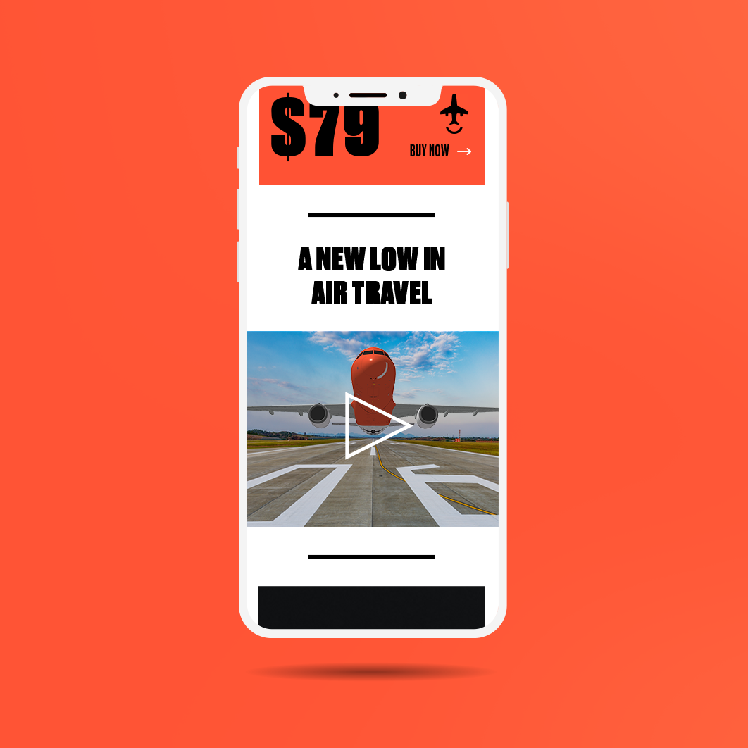
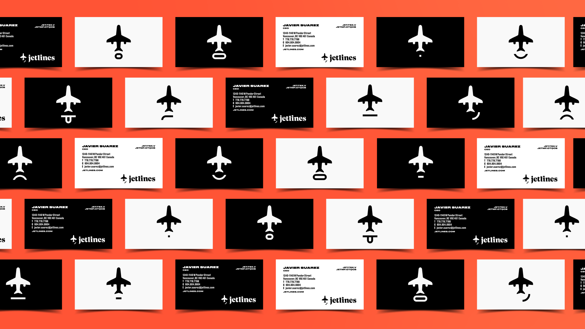
To achieve this, we moved away from the safe, traditional palettes of the aviation world and adopted a high-voltage orange identity—loud, unmissable, and instantly recognizable at the gate. The strategy centered on injecting a sassy, human personality into the brand. The logo features a knowing smirk created from an upside-down plane, a motif that expands into a library of expressive faces used to communicate everything from flight delays to seat sales with a relatable wit.
The system was applied to the massive scale of the airline ecosystem, from the livery to the flight attendant uniforms and digital booking experience. While the airline has since ceased operations, the work stands as a testament to bold brand strategy—proving that a low-cost carrier can own a premium, high-personality position that disrupts the status quo.